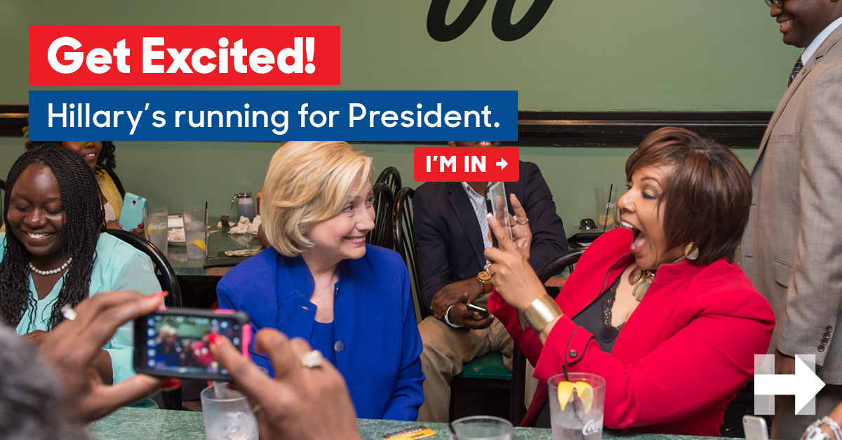
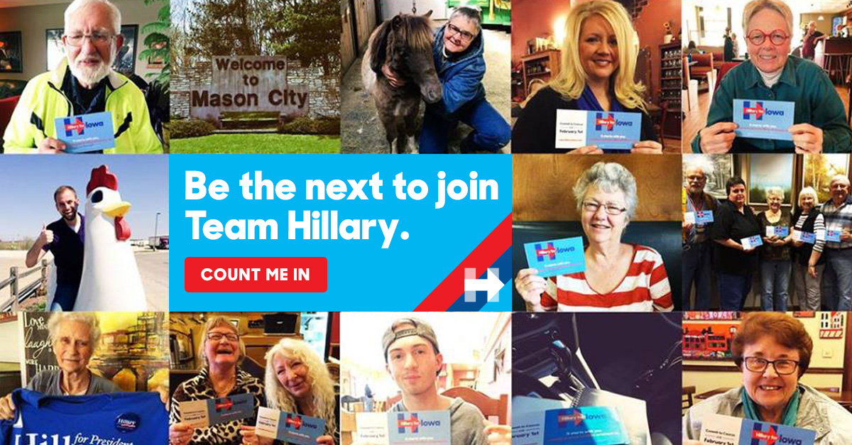
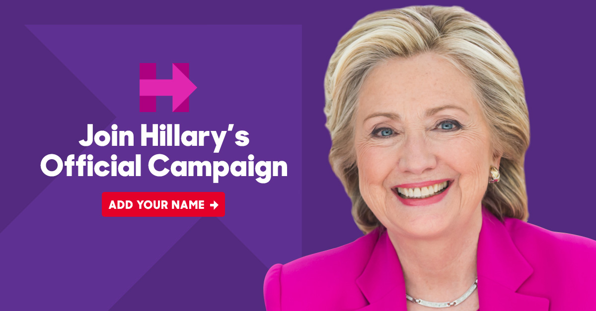
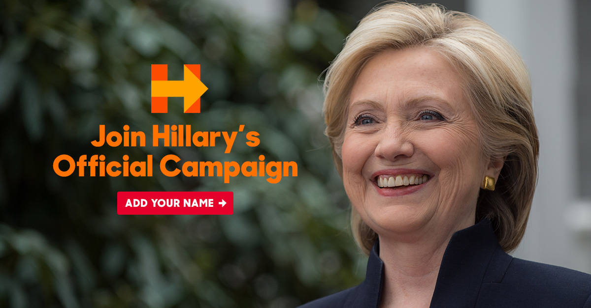
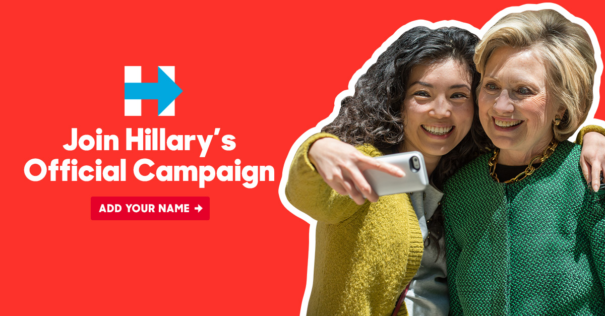
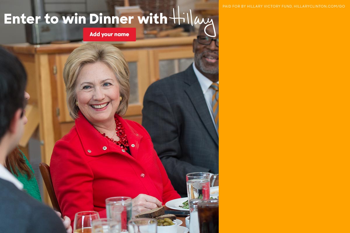
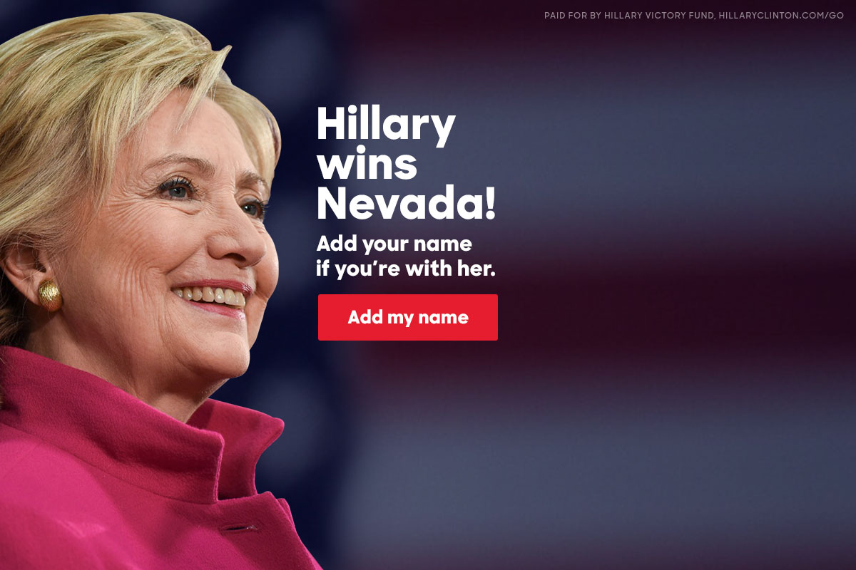
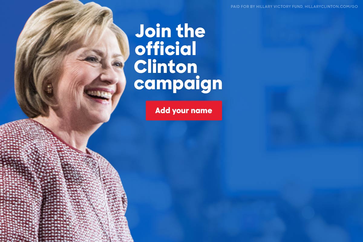
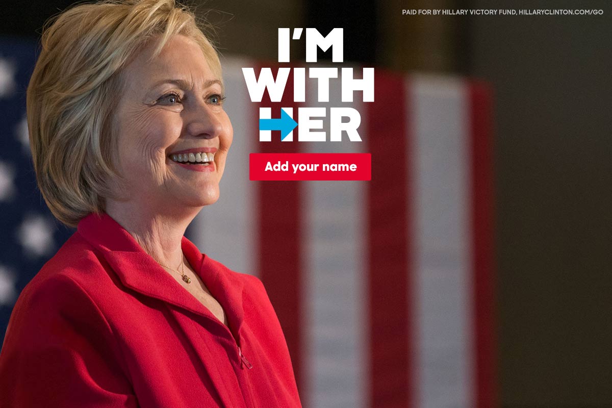
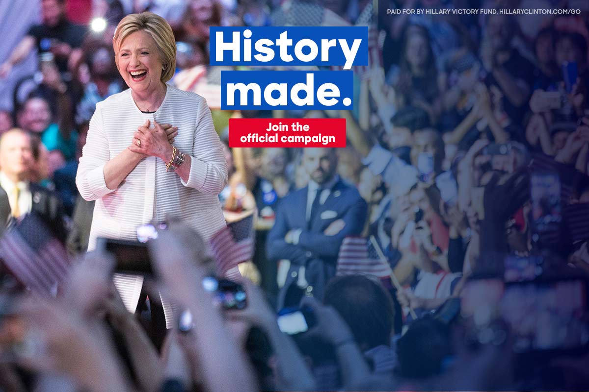
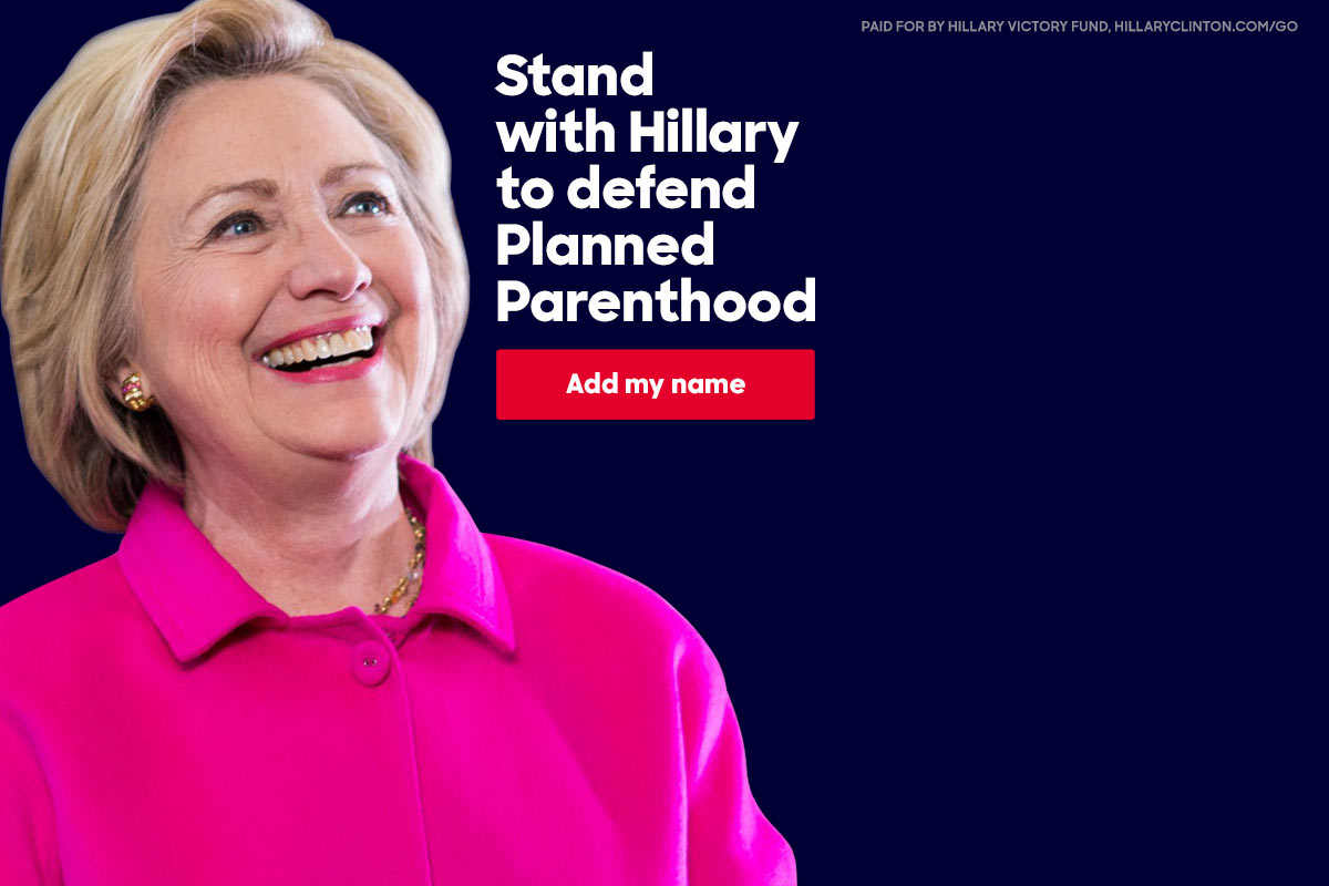
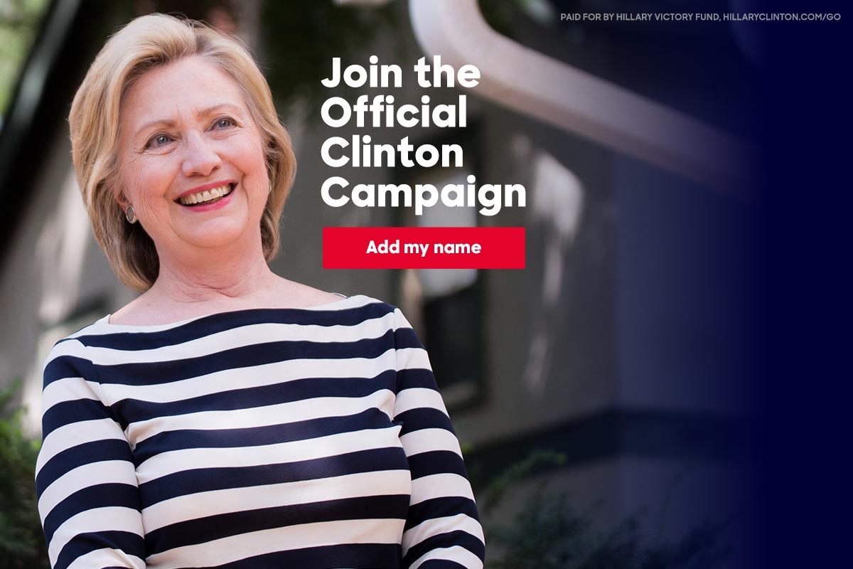
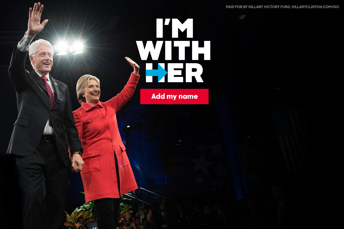
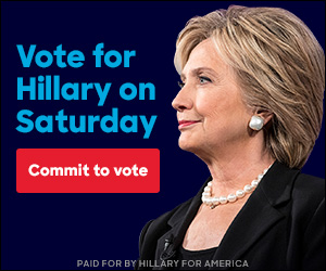
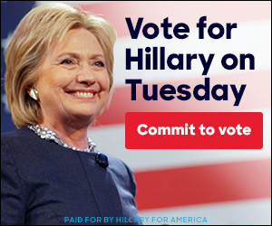
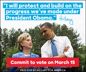
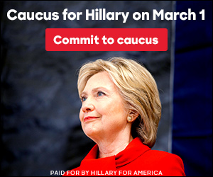
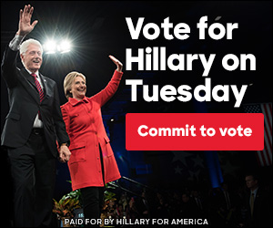
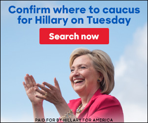
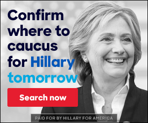
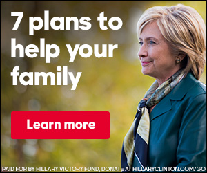
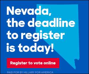
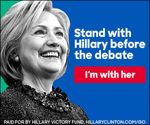
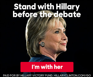
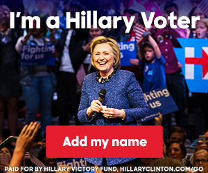
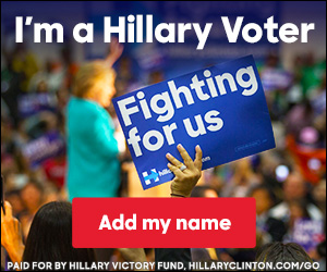
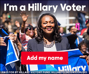
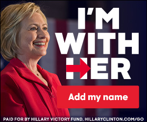
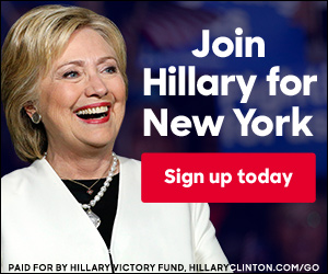
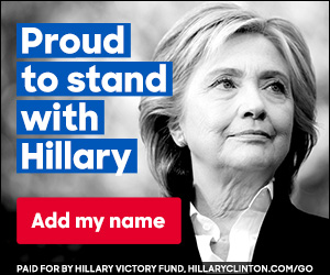
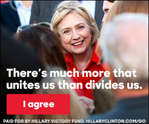
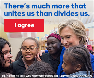
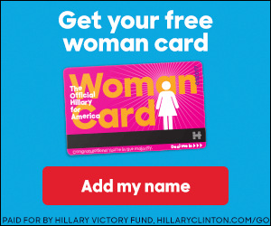
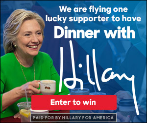
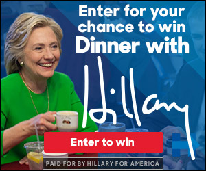
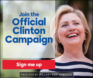
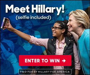
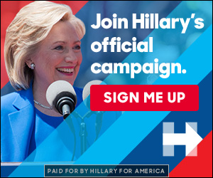
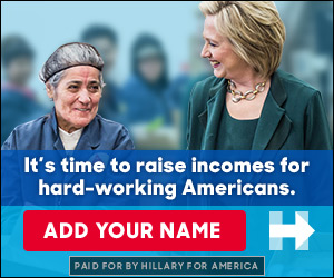
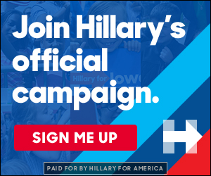
Hi, I’m Al. I am a digital advertising specialist with more experience developing banner ads than anyone else you’ll find. As a member of her digital team, I produced the following 100 banner ads for Hillary Rodham Clinton’s 2016 Presidential Campaign. I also developed the highest-performing ads for both of Barack Obama’s campaigns. Contact me at Al Designs. I’d like to help with your banner ads too!
The Hillary Clinton 2016 Presidential Campaign Digital Ad Experience
A Presidential Digital Ad History
I’ve been designing digital banner ads since 1997 and for political causes starting with Barack Obama’s 2008 Campaign. I stayed on for his 2012 race too. I was lucky to have joined Hillary Clinton’s Presidential Race in 2016.
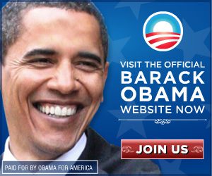
2008
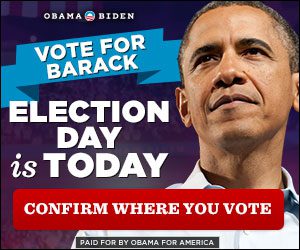
2012
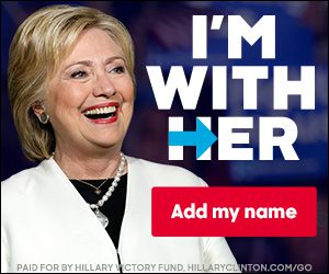
2016
1 year, 8 months and 7 Days of Hillary Ads
I joined the campaign in March of 2015 before Hillary’s public video announcement in April. I continued as part of the Digital Team until Election Day, signing off with some lovely Election Day countdown banners. I had asked for a campaign title like “Hillary’s Director of Banner Ad Goodness†or perhaps “Hillary’s Hammer of Banner Ad Designâ€. I’m still waiting to hear back on that.
This is what it feels like a year and a half away from an election.
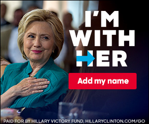
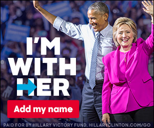
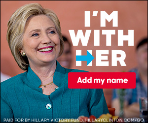
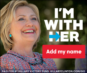
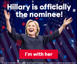
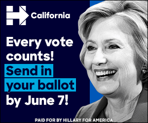
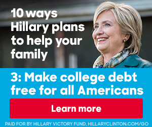
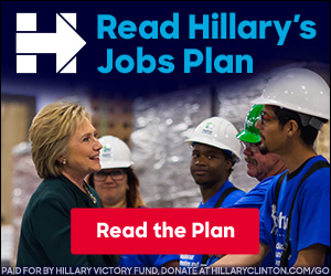
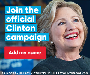
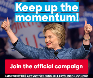
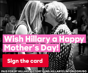
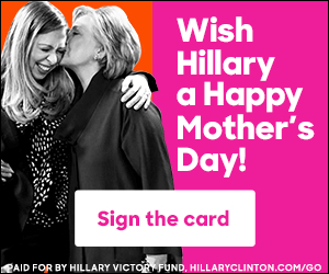
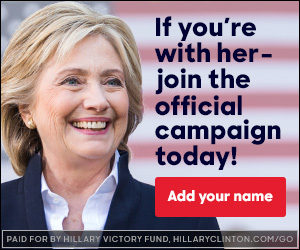
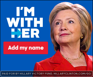
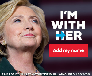
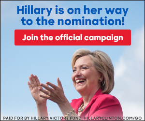
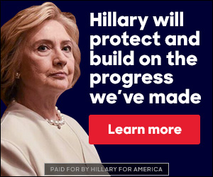
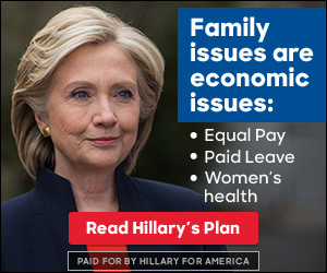
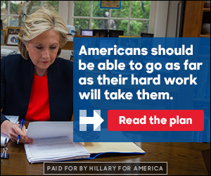
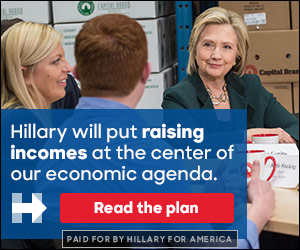
I produced over 100 Banner Ad Campaigns for Hillary
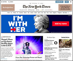
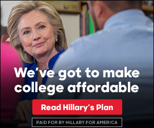
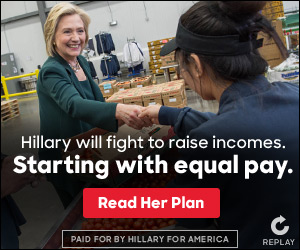
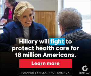
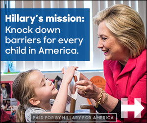
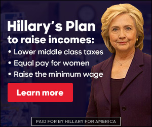
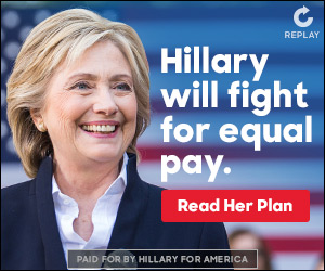
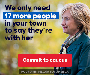
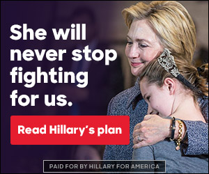
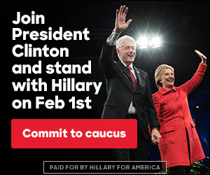
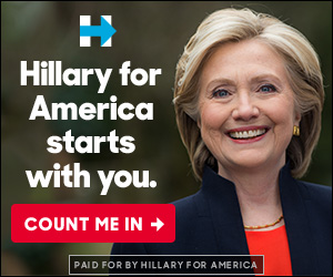
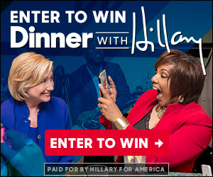
Chances are that if you own a computer, you saw one of the ads I’ve displayed on this site. The campaign bought ad space pretty much everywhere leading up to the election (Politico, MSNBC, Yahoo, AOL, MSN, Mother Jones, etc.). They were shown with specific messaging and countdown timers in swing states. The ads were seen by millions, if not Gorillions, of people daily. Here are some of the placements I caught…
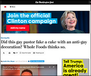
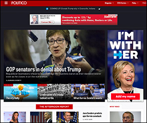
Some awesome people I spent the last year talking with:

Barely two days went by without talking to Maxwell Nunes, Hillary’s Digital Ads Strategist, who assigned and managed the projects I worked on. Maxwell easily took the reigns of his job – getting all of the moving pieces of each ad campaign in order, managing all the people involved and working quickly to get Hillary’s ads up and running under our ridiculously tight deadlines. He was always professional and easy to work with. Without his teamwork my job would have been impossible.
Danielle Butterfield, Deputy Director of Digital Advertising. I worked closely with Danielle during the Obama campaign of 2012. She completely cares about the candidate and the way that candidate’s messages are presented. Both her effective oversight and vast attention to detail are all over the ads on this site.
Andrew Bleeker, Campaign Advisor, discovered me to work on the Obama Campaign in 2008. He started our conversation asking if I “wanted to change the worldâ€. If I have run into anyone who has helped to make digital advertising a success in the last 20 years, it’s Andrew with his team at Bully Pulpit Interactive.
My dogs, Harvey and Crash. I have spent almost 2 years working most weekends and a slew of 14 hour days within the confines of my office. At the end of every work day, I walked my dogs and told them about the campaign.
So happy to be done with that font

So much.
Hillary’s initial branding guideline was beautiful, but the font the campaign chose sucked my soul away. Unity Sharp is a great font for one or two lines of copy used in a big space. Unfortunately, banner ads are not a big space and use multiple lines of text with tight leading. Unity center or justify evenly. The ascenders of the letter forms are radically uneven. That causes line space to be disproportionate on multiple lines. This forced me to tweak every body copy block manually to get multiple lines to look right. From ad to ad it wasn’t much of a problem, but there was one project before the primaries that involved changing copy for 10 designs in 1500 separate sizes and text options. Never before had a font caused more sleepless nights. I am hopeful that the font will be altered if the 2020 election cycle involves it. Otherwise, I may need to seek counseling. “But Doctor… that font.â€
Trumptastic
“Hillary has spent hundreds of millions of dollars making ads that say not-nice things about me.â€
– Donald Trump, September 26, 2016 Presidential Debate at Hofstra University
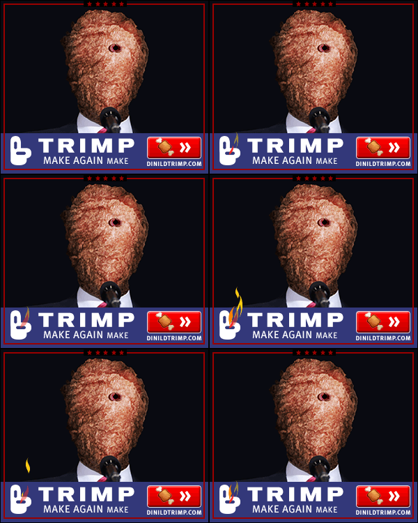
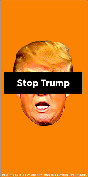
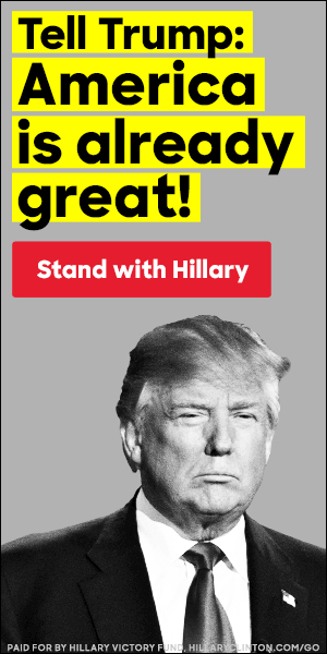
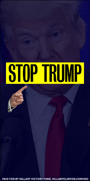
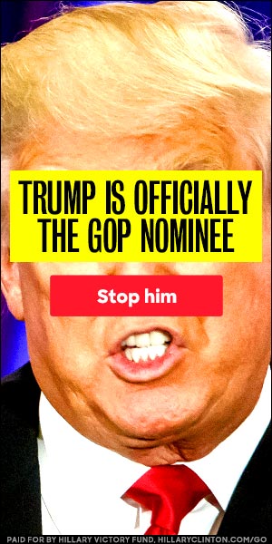
While I definitely made a few Trump opposition ads for the campaign, I also made a few fan-banners in my free time for Dinild Trimp, a faux Trump candidate represented as a literal meathead. I’m still awaiting my millions from anyone willing to send it.
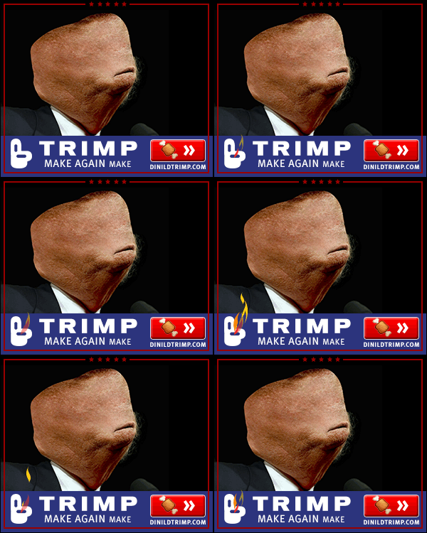
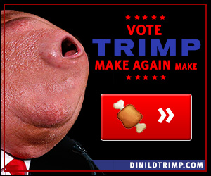
Press
Trump vs. Clinton on Display Part 1: Hillary
2016 Presidential Candidate Display Advertising Strategies Revealed
THIS IS 100% TRUE: ‘Ready for Hillary’ Banner Ads Embedded With Nuclear Launch Codes.
Clinton Campaign Geniuses Spend Ad Money on AOL Login Screen
Hillary Clinton’s Digital Staff Gives 6 Marketing Lessons They’ve Learned From This Bizarre Election
Hillary Clinton vs Bernie Sanders: Which is the Better Digital Marketer?
What Marketing Tech Are Donald Trump, Hillary Clinton and Other Candidates Using?
Trump Spent Far More on Online Ads Than Clinton in June
Clinton spends $30 million on digital ads to reach snake person voters
Campaign banner ad specs:
Initially, all of the animated ads for the campaign were produced using Flash Animation. In October of 2015, Google Chrome and the rest of the internet switched over to HTML5 Advertising. All Ads were served with a static backup file.
The sizes for each campaign were generally completed in the base 300×250, 728×90, 160×600, 300×600 and 970×250 sizes. There were always some special requests for odd sizes, like Facebook, Twitter, AOL and Sign-in pages.
Ads were generally under 100k and below 15 seconds.
 Call me. I’m yours.
Al Rotches, I make people click on things. aldesigns.com hello@aldesigns.com linkedin.com/in/alrotches
Hi, I’m Al. I am a digital advertising specialist with more experience developing banner ads than anyone else you’ll find. As a member of her digital team, I produced the following 100 banner ads for Hillary Rodham Clinton’s 2016 Presidential Campaign. I also developed the highest-performing ads for both of Barack Obama’s campaigns. Contact me at Al Designs. I’d like to help with your banner ads too!
 July 2016–November 2016 Banner Ads
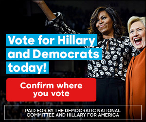
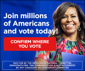
 2016 Trump Opposition Banner Ads
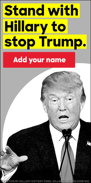
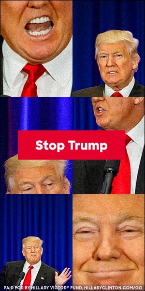
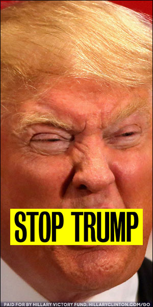
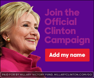
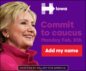
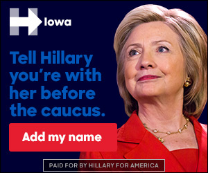
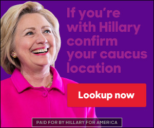
 March 2015–July 2016 Banner Ads (Primaries)
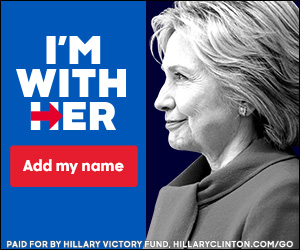
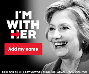
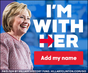

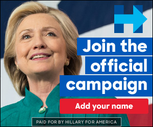
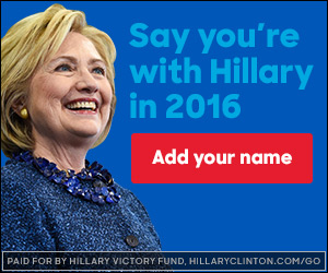
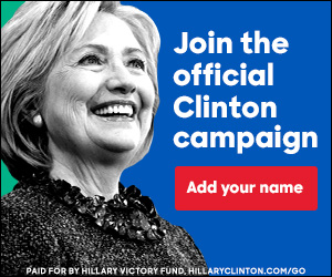
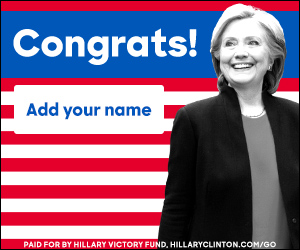
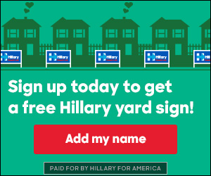
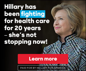
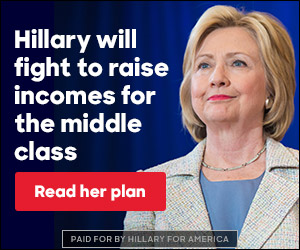
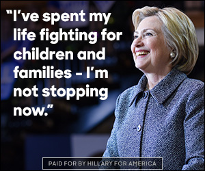

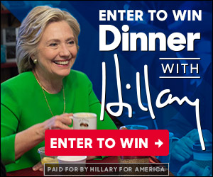
 Social Media, Sign-in Pages, Static Ads

